Some reflection

Today my supervisor and I talked about the creative process and how I usually do in terms of combining programming work with the design aspect. I remember that when we met, we talked about it and as I did not have much experience I thought that design would come first, and then I would code to make things work. But today we brought this up again and I realized that in practice it does not work like that – ok first I did some design, some visual prototype, but when I started coding, I did not stop working with the design either. It was not like first I do the design and then the code, period! You work with both all the time.


Co-designing workshop

After I was done with the lo-fi prototypes I showed them to my customer, to see what he thinks about it, if he understood the structure, the features, and so on. And also to see if he was satisfied with the outline. And I also gave him a task – draw his vision for the app.

Furthermore he has shown how he works today, the several applications, services he uses today, without any integration. It takes a lot of time to keep all the client files updated. He also stated that many of these applications are too confusing. He considers himself computer literate, but even so he has hard time understanding these platforms.

It became clearer what he wants – a very simple interface where he freely can add information – customized exercises, notes, stats, everything gathered.

It is also important that he can administrate, make changes, whereas the clients only have access to information, without being able to make changes.

That would require both front-end and back-end development, something I am not that familiar with. But he said as long as you can send somehow the info, it is fine – the first thing that came to mind was email function, but he also tends to get carried away.

Finally, he told me about a Facebook group for personal trainers, where some of them expressed frustration concerning the absence of a simple , straight-forward tool.

I wondered if he would be willing to participate in a workshop with other professionals in the area, but he sees it as a risk due to concurrence. However he would eventually bring this up in the Facebook group.


Sketch and Prototype

Now that it is clearer what the application will be like, what functions it will have, I started doing wireframes in an old school way – paper and pen.

So, after the research and brainstorming, we had to discard Volt app concept – it is not created for the trainers, but instead for the clients – that could even lead to an equivocal feeling that the trainer is expendable and replaceable by an app that is much cheaper.

That’s not what we are looking for – our goal is to help the trainers, make their work more efficient.

The first step was to make a wireframe that shows the main functions, and interactions – what kind of feedback you are expected to get for every action. It is not a representation of the graphic interface, or design per se, but the representation of the application logic.

The wireframe also works as starting point for making lo-fi and hi-fi prototypes – once you know what functions and hierarchies they will have, it becomes easier to place them in a graphic context.

I sketched by hand (with pen, paper, and pro markers) frame by frame, and after that, I made new prototypes with Photoshop – still lo-fi but not as lo-fi as drawing with pencil and paper.

screen3

Lo-fi with Photoshop


Brainstorm and research

After discussing the project task,   we met and had a brainstorming session – we went through functions that he wanted for the application. In this session, he explained first the problematique – within his branch there isn’t a all-encompassing app, where the personal trainer can use to both enter information about the client, screening test results and enter a workout plan that can be easily mailed to the client. So we went through some of the existing apps and platforms, so he could show the flaws. So we together came up with some ideas on how our app could look like in terms of functionality and user-friendliness. After this meeting, I looked for other examples, similar applications, in order to see what has been done, and what needs to be done. Most of these apps are inflexible, since the user can only enter an exercise that is already in the app database – what if the trainer wants to enter a completely customized exercise? I actually found ONE app where the user can enter customized exercises, but after the trial period, you have to pay a monthly fee or something. It is called Volt and is niched for sports, and athletes, the same niche as my customer works within. However the app is directly to the trainers’ clients, whereas a work tool for the trainer is what we are looking for.

So after this session, it became clearer what our application would be like – which functions it would have, and how it would address the aforementioned issues.


First days at Tapper Geist AB

My first days as an intern were somewhat overwhelming. I was not quite sure if I would be achieving anything usable. Let’s just say that my self-confidence level was pretty low. As I would be working basically on my own, since I got my own project and customer, I was feeling intimidated. My supervisor would help whenever necessary, of course, but when it comes to the coding part, there was nothing she could do, since her expertise is the design part.

From the very beginning I developed a close contact to my customer, IFC. We discussed the project, what was expected from me and so on. The customer was always understanding that the focus is the learning process, rather than developing a “ready to ship” product.

We also had to establish some delimitations, due to lack of time and resource – initially there was some wish to develop an iPhone app. But I made it clear that such type of app would require much more time, and as I am the only one programming, it is not realistic to develop an Iphone app during this time, but of course this wish could be pursued once the internship is over.


Final Essay – Ambiguous about ambiguity

Introduction 

Ambiguity (noun am·bi·gu·i·ty \ˌam-bə-ˈgyü-ə-tē\)

 (…) the fact of something having more than one possible meaning and therefore possibly causing confusion” (Cambridge dictionary –Online)

Given the definition above, one can wonder if ambiguity has any place within Interaction Design. As Gaver et al. (2003:233) points out, ambiguity is usually something undesirable – usefulness and usability are considered two imperatives to Human Computer Interaction community – how could an interface be any useful if the information it sends is confusing?

The authors claim, however, that ambiguity can actually be seen as an opportunity rather than merely a design problem. Their argument is that, while ambiguity can be confusing and lead to frustration, it can also be mysterious and exciting. Moreover it leads to increased personal relationships with the object, because the user will make a huge effort in trying to decipher it (Gaver et al, 2003:233).

During our fourth module we were introduced to this concept, and we were supposed to work with it, or at least consider it when sketching and building the prototype. I have never thought that ambiguity could be desirable or something to strive after.

Understanding ambiguity 

As aforementioned, Gaver et al advocate ambiguity as a way to enhance interaction with an object by impelling people to engage themselves in trying to grasp the design (2003:233). The point is that they will put so much energy in trying to figure out how the object works and the concept behind it, that it will lead to deeper relationship between the user and the artifact (ibid).

When it comes to ambiguity I have always associated it with confusing information the artifact conveys. However, Gaver et al. expand my understanding. There are two other types of ambiguity besides ambiguity of information, namely contextual and relational ambiguities.

In this session, I will briefly explain these three types of ambiguity.

Ambiguity of Information

Here the ambiguity arises in the manner that information is presented to the user by the artifact. It can be in form of unspecific GPS coordinates given to people playing a game – for instance scavenger hunting (not exactly the example given by the authors) – it will be more challenging to those playing it, and it will evoke cooperation between the players in the same “team” in order to decipher the game fuzzy hints and imprecise coordinates (ibid:236).

Ambiguity of Context

Ambiguity is not only about unclear information you get from an artifact. It can also be an artifact that is supposed to be used in a certain way, but the designer assigns a completely unanticipated usage to it, which leads to user’s puzzlement and why not amusement? The example given by the authors is a sculpture, Duchamp’s Fountain, which was actually used as a urinal. The interpretations are conflicting – is it art or is it where you fulfill your physiological necessities (Gaver et al, 2003:236)?

And finally, ambiguity of relationship, which arises from the viewer’s personal relationship with the artifact (ibid:237). One example is the Waterbed (see Larsen, 2013:60pp), where someone simulates intercourse , something very private, and the bed makes different sounds depending on the pressure you put on it – it was done as an art installation, and it gives a new role to the viewer, who in this case becomes more than a viewer, and becomes a voyeur.

The authors go on to explain how you can enhance ambiguity of information, context and relationship (Gaver et al, 2003:237pp). They believe that enhancing ambiguity will make the artifact system seem more attractive and mysterious and it will make people want to join in the work of making sense of an artifact system and its context (ibid:237). They do however show under which circumstances this might work – it can be by using imprecise representations to emphasize uncertainty, e.g. showing blurry graphics, or by adding inconsistent functions to a given artifact or by offering unfamiliar roles that can lead to increased imagination.

They conclude their article by considering ambiguity as potentially positive that can lead to crafting interactive designs enhancing personal relation to the artifact and that stimulates the user’s thinking process (ibid:240).

You can even see a link between this idea and Fokkinga and Desmet’s text on enriching user experiences with negative emotions (2013). For these authors, designers can enrich user experiences by purposefully involving negative emotions under certain circumstances – they show how negative emotions can make a product experience richer and enjoyable. They present to us ten experience qualities that combine three steps in how to turn something negative into positive. For that to happen, the designer will decide 1) which negative emotion will be evoked, 2) how and when this emotion is best stimulated and 3) which protective frame is most appropriate to use and in what way it is applied. In other words, it is about how a designer will trigger a negative emotion in the user and which mechanisms will be offered in order to turn this negative emotion into something positive (Fokkinga & Desmet, 2013).

The clearest similarity we can see in these two texts is when Fokkinga and Desmet explain the challenging attribute, which entails an experience that is frustrating yet engaging problem that people are determined to solve. As the aforementioned example on ambiguity of information (scavenger hunt), the user can experience it as frustrating – unclear coordinates and fuzzy hints, and feels a dissatisfaction from dealing with something so hard and confusing. But at the same time, they become more focused – they have a goal to achieve, so in order to succeed, they engage a lot in the interaction with the artifact, trying to figure its system out (2013:27).

Ambiguity as an interaction quality has probably gained ground within HCI due to a shift from user-driven design, in which the user’s needs are central in product and service development and from technology- driven design that implies applying newly developed and invented technology (Maeng et al, 2012:449) to a interaction-driven design, which aims at exploring product possibilities and interaction attributes. Consumers were, according to the authors, attracted to functional useful products that fulfill their needs, but today you do not see many functional discrepancies among the products in the market, while the technology used by the companies became increasingly homogeneous (ibid:448). So how is a company supposed to attract consumers if it does not offer anything that lead to competitive advantage in relation to other companies? By focusing on user experience? That’s right, and where interaction-driven design comes in to play an increasingly central role within HCI and product development.

Designing for ambiguity in practice – The Magic Hairbrush

Given this brief theoretical account, it is easier to explain our design process having ambiguity in mind.

In previous modules, we never flirted directly with the idea of creating something susceptible to several possible interpretations or unconventional functionalities – we have always strived after clear and user-friendly designs, the usual goals in HCI, as it has been mentioned before. In hindsight I do however notice a shift from user-driven to a more interaction-driven design in our work – now the focus is moving from the user’s needs and desires to experiences, how the user interacts with an artifact and perceives the experience. Our projects became gradually more abstract and conceptual, susceptible to different interpretations and, therefore, less concrete.

Module four was a novelty for us – ambiguity from being considered unintentional becomes a conscious choice. The theme of this module was body in everyday movement. We are supposed to turn something mundane into a richer experience, with the help of Arduino, sensors and sound (using Ableton). And for that, we were introduced to three concepts: ambiguity, tightness – ok, this one was not new, we read Wensveen et al.’s text (2004) in module – and openness. For us, tightness and openness were something easier to achieve. But ambiguity? How is a trivial activity supposed to be ambiguous?

After reading Gaver et al’s text (2003), it became clear to us how we would explore ambiguity – We chose to work with only one type of ambiguity, namely ambiguity of information. Honestly, we were not sure how to achieve it; we only set it as a goal.

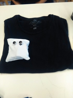
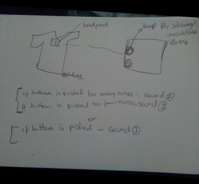
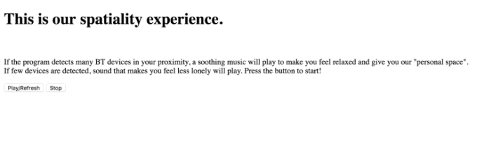
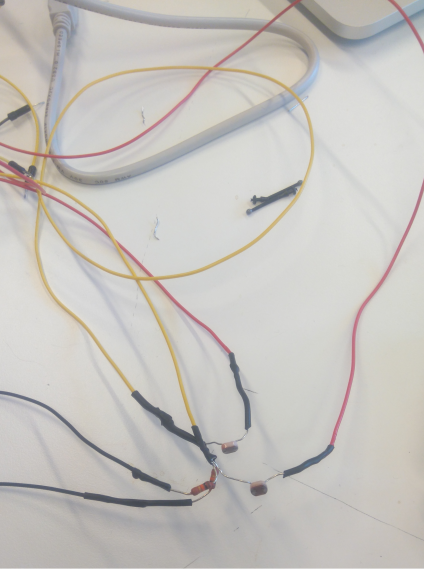
The everyday movement we decided to work with was brushing hair – a movement that is one-directional, repetitive and usually slow-paced. After considering all the possibilities, we decided to use two photocell sensors, mostly because they are cheap and yet versatile. They would be used in two different places among the bristles – one in the middle and other on a corner. The idea behind it was that they would capture different data – the light is distributed unevenly along and across the hairbrush due to angle variation. When you use the brush, you will get different sounds and this design is ambiguous because you are not sure what the output will be, what kind of sound you will get. Another variable that makes the design more ambiguous and that we discovered during our sketching sessions is the user’s hair color – my hair is almost pitch black, whereas my partner has a lighter hair color, and imagine our amusement when we got different results!

Despite the design’s ambiguity, it has a certain level of comprehensibility – something will happen when you brush your hair, and once you start brushing, you will soon figure out that sound will be produced, and the way you brush your hair will have an impact on the output, but you do not know HOW.

We achieved the goal to make the design somewhat ambiguous. We could have explored other ways to enhance ambiguity, but given the time constraint we have decided to keep it simpler.

Did the ambiguity of the design lead to enriched experience? I cannot say that it turned something mundane into pure excitement, but definitely more fun to brush your hair and having different sounds as feedback. However, you tend to get annoyed after a while, i.e. the brush coolness and novelness are short-lived.

Conclusion and Final Reflection

After reading the text and finishing the module 4, my perception of ambiguity in design has not changed much – from completely ignoring its existence within the realm of HCI to coming to terms with its use, however in a very limited extent and scope. This can be noticed when you read the examples given by Gaver et al (2003). None of their examples serves to a real purpose other than shocking or/and entertaining people.

I think that there are some circumstances under which ambiguity can be considered positive – usually it involves experimental or artistic designs, toys and games, since they do not have any function other than entertainment and contemplation and in some cases enticement of one’s imagination and thinking process.

When it comes to interaction design in terms of making our lives easier and facilitating the interaction between people and machine, the use of ambiguity is inappropriate, since it slows down the understanding on how things work. As an example we can take “smart” home appliances, i.e. in the realm of Internet of Things – they are created in order to better serve our needs, by minimizing the time and energy spent on mundane activities, so we can focus on productive, meaningful activities instead.

I might be considered old-fashioned, but my goal as interaction designer is to make our lives easier and help those who need it the most. My focus is on user-driven design with some interesting twist that does not drag down its functionality. And I still think that ambiguity is usually an excuse for bad design. There are, in my humble opinion, better interaction attributes to focus on, such as tightness, since it leads to perceived couplings between action and reaction that are inherent in mechanical products and that electronic products often lack (Wensveen et al., 2004), or in other words, the artifact becomes a natural extension of our bodies.

References

Cambridge Dictionary. Ambiguity. Available on http://dictionary.cambridge.org/dictionary/english/ambiguity. Last accessed on 4 November, 2016.

Fokkinga, S.F. and Desmet, P.M.A.(2013).’Ten ways to design for disgust, sadness, and other enjoyments: A design approach to enrich product experiences with negative emotions’. International Journal of Design,7(1), 19-36

Gaver, W et al. (2003) Ambiguity as a Resource for Design. Florida: CHI

Larsen, H (2015)Tangible participation – Engaging designs and design engagements in pedagogical praxes [dissertation]. Available on https://lup.lub.lu.se/search/publication/5265731 , p. 54-67. Last accessed on 4th November 2016.

Maeng, S. et al.(2012) ‘Interaction-driven design: A New Approach for Interactive Product Development’. DIS, 2012, June 11-15., Newcastle, UK.

Wensveen, S et al.(2004) ‘Interaction frogger: A design framework to couple action and function through feedback and feedforward’, DIS, 2004 , August, Cambridge, MA. USA.


Show and tell

Today we had our presentation on the fourth and final course module, and we have seen very interesting concepts.

When it comes to our work, people seemed to like it , they found it interesting – it was a big plus that no wires could be seen, so they thought it was very well assembled. Their feedbacks made us feel proud, after so much struggle with building the prototype and connecting with Ableton. Our teacher also liked the fact that we used the photocell sensors in two different spots  in the brush, because they could collect unequal data. Furthermore, he commented on the design tightness – the hairbrush felt tight not only in terms of immediateness – you use the brush and get an output – but also in terms of closeness, i.e. the closer it gets to the hair, the more intense  the sound gets; and modality , i.e. the sound will change depending on how you brush your hair.

This finding was actually very interesting for us because we used the same type of sensors and still we got differential results – before implementing them, we did not think about an important variable – angle. As the angle varies along and across the brush, you will get uneven distribution of light.

Summarising, we received a very good feedback and all the struggle we had to conceptualise and execute the design was worth it.

When it comes to other groups, there were also some interesting design concepts. My favourite one was developed by Marcus and Emil – a paintbrush that sounds differently depending on how you stroke – they played with bass and treble. Something remarkable about this group is that their design was based on research – before they started sketching the design, they read a lot about how paintbrush can be used.

The research part we have sort of skipped, and now in hindsight, we could have gone deeper with our design. I suppose it was the time constraint that made us go straight to brainstorming and sketching.

Many of the other groups used light sensors as well, in different ways – which made me ponder – how incredible and versatile a light sensor can be, and yet so simple!

Concerning our own presentation, i.e. the show ‘n’ tell session, I was rather satisfied – we managed to describe what we have done, why and how, and explained the concept  in terms of ambiguity, tightness and openness. We have also brought up technical issues.

This module was very challenging – we were newbies when it comes to Ableton, we struggled a lot with playing with sound, and sketching something that works – technical and aesthetically and that is interesting at the same time – how to make something trivial , unremarkable into something more exciting?

But in the end of the day, every minute of frustration  was worth- we learnt a lot, not only how to use Ableton and avoid short circuits, but also how a ideating, conceptualisation, sketching process works. Additionally we succeeded in turning something dull, boring into something interesting.


Make it work

Today there was not that much left to do – it was basically tinkering, and making the design look better, and work more effectively. Our initial plan was to use the breadboard inside the brush, but Lars pointed out its weaknesses – we should loose the breadboard, because the way it was connected could easily lead to short circuit. Besides it takes too much space. So we did as he suggested – we soldered all the parts – the photocell sensor to the resistor, and to jumper wires, and insulated the exposed wires with heat-shrink tubing. We made two sets of photocell sensors – and these sets were also connected to each other – the positive part from one, with the negative part from the other. Why that? Why positive from one with negative from the other? Because we wanted to invert the behaviour of one of the sensors, so the best thing would do it on the circuit.

soldering.png

After soldering, the hairbrush looked much better, and we did not have any more problems with short circuit, malfunctioning sensors. We also glued a frame made of carton package around the brush in order to make it look nicer and more stable.

finishedbrush

Finished brush

After that we started sketching with different sounds, filters and variables, trying to figure out what would work better. We did not have many options to choose from when it comes to audio files. So we chose the less scary one, and edited /cropped it in order to sound better. One of the sensors – the one in the middle – was linked to res, which implies its sole function was to trigger the sound. The other sensor, to the side, was connected to frequency and responsible for the different outputs we would get depending on how we brush our hair.

Here is the finished product:

When we were done with all the sketching, we started to discuss interaction attributes  – ambiguity, tightness and openness. We felt that our hairbrush was ambiguous enough in terms of information because the sounds that came from the brush was unpredictable and when brushing or moving the brush in different directions you would get different outputs. Of course we could have explored the other two types of ambiguity – context and relationship – but we wanted to leave some room for clearness in the interaction with the hairbrush, in the meaning that we knew there would be some kind of sound when it was moved, but we did not know WHAT sound it would come over time, since it depends on how you brush your hair and even on your hair colour, since the sensors showed to be very sensitive to clothing colour and hair.

When it comes to tightness, it was the first attribute we succeeded with – the hairbrush reacted directly when it was approaching our hair – The closer the brush would get to the hair, the more intense the sound would get – so we can say that tightness is not reduced to immediateness aspect, it is also connected to the closeness aspect – as if the hairbrush was the extension of your hand. When it comes to the openness aspect, there is a lot of room for discussion – in theory our hairbrush is open – it can be used anyhow, anytime, anywhere, by everybody. But if we put the brush in a context, we begin to see its limitations in terms of openness  – is it okay to brush your hair during a business meeting? If you follow the prevailing social norms, you would not even consider this possibility. Can you use this hairbrush as a weapon? There are no physical constraints to that, but what about moral, behavioural ones? And hairbrushes were not intended to be used as a weapon, from a design point of view.

When it comes to bodily experience, the way the hairbrush sounded could send you a signal telling you when to brush your hair more slowly, carefully, and that would affect your behaviour. If you do as you are “supposed to” , then you will get a calmer sound as a feedback, which might also lead to a relaxed state of mind.


Sketching

Today we spent many hours trying to figure out the best design for our concept – the “magic hairbrush”. We had two Arduino sets with respective components (sensors, jumper wires and resistor) and two hairbrushes. One had the Arduino circuit on the  brush’s back, and the other inside the brush.

The importance of sketching is to find the best solution, see which design works more efficiently.

In our case we went for digital sketching, because it is necessary for us to get as close to a working prototype as possible, since interaction is a central part, something hard to achieve with lo-fi sketching.

After a whole day of sketching, trials and errors, we have decided to go for the design 2 (the photo on the right), because it is more compact and less exposed wires in case we make it work.

We were unsure about where the sensors would be located in order to make any sense. We were advised to put both sensors in the front, among the bristles – one in the middle and the other more to the side. The point of doing this is to compare the amount of light each selected spot gets – the light distribution is heterogeneous along the brush , due to different angles and how you brush your hair – one part can be covered while other receives light (inclination).

We have also considered using accelerometer instead of a second photocell sensor, but the time is short.


Sketching

Today we had lecture about sketching, not necessarily through drawing but even through bodystorming. We are supposed to sketch our design first, so we know what elements are important and interesting to be used in the design.

Today we hooked up two photocell sensors to Arduino, and through Ableton we were able to play two different sound files, depending on which sensor receives light/shade.

We were not absolutely sure about our concept, it did not seem to be much room for ideation since the design is around a hairbrush. But the teacher has shown to us that yes, there is room for ideation – the focus is on the design’s behavior, not on the material itself, important here is how it is used, and what happens. Now we feel better about our concept because we know we are on the right path.

Here is us testing the photocell sensors with Ableton.

Ableton meets Arduino

Hi there!

Today we started the day with theory, about interaction qualities such as tightness, openness and ambiguity, based on Henrik Larsens dissertation. We also had an exercise in groups of four and the assignment was to compare two designs in terms of the aforementioned qualities.

After that we started working with Ableton and Arduino under Lars instructions. We got to test a project set uploaded on Itslearning. We used a potentiometer as analogue sensor – it is a knob from one to three, and you can assign this knob a parameter connected to a sound file – frequency, track volume, track spanning etc.  My partner and I focused on track volume but we even tested other parameters.

Check it out

We were also advised to switch from flex sensor to photosensors , that is, a type of resistor that reacts to light. So the idea is if you approach the brush to your hair it will get dark and you will get an output. If you stop brushing your hair, it will get lighter and you receive another output.

Tomorrow we will try to hook up photosensors and see if we can create something cool with Ableton.

We want to achieve a high tightness – an action will lead to immediate feedback. It would be nice as well to create ambiguity in terms of information – the design will change its behaviour after a period of time, for instance.


Introduction to the topic

Today we started by having a dynamic lecture with exercises about bodily movements and interaction. We as a group of three were asked to analyse an interaction ( putting clothes to dry on the wire) and its movement characteristics such as rhythm, temporal aspects, whether it involves the whole body or only some parts of it and sense of one’s body (how it feels).

After that, we received the brief to next project, which is about everyday movements coupled with simple modulated sounds.

We should focus on the interaction and behaviour of the design, rather on the sounds.

Furthermore, we are supposed to use two sensors plus two output sound files in our design.

After the brief explanation we made an exercise in pairs (our assigned ones). The task was to pick two sets of interactions involving bodily movements and stick to one set and write down its characteristics.

We brainstormed first and came up with many examples :

  • shake a feeding bottle
  • take notes
  • get up from bed/chair
  • lift a child
  • get dressed
  • teach a child to walk
  • brush hair
  • brush teeth
  • walk
  • turn on the lights
  • write on the computer
  • check the phone

The two sets we found more interesting were brushing hair and taking notes (yeah it feels a little bit meta). The final choice we made was hair brushing, because taking notes implies very limited movements. Besides, brushing your hair allows openness in the meaning that you can brush your hair anywhere, anytime, anyhow (with some limitation). The movement characteristics of brushing hair are the following:

  1. repetitive
  2. limited movement
  3. rhythmic
  4. (usually)slow & light movements
  5. one-directional

For explanation check our video!

After that we presented our concept to Lars and Henrik, and discussed about what sensors to use. We are leaning towards flex sensors that detect different flex movements, such as from your wrist.

We are going for a more flexible, bendable brush , so we can put the sensors on it.


Show ‘n’ tell and Reflection

Our show ‘n’ tell

Today we had presentation of our concept, and it went fine. I guess we were clear and covered all the main points regarding nuance, pixels, touch, and skilled learning.

And our prototype did not ‘misbehave’, which is always a plus, and we did not have to fake it.

We got positive feedback, and some of the “objections” were addressed spot on – someone asked why we did not use sound as feedback, and I replied: well because this module is about pixels, not sound…

Our concept

We also got constructive criticism from our teacher, mainly concerning the concept’s depth concerning 1) nuance and 2)feedforward.

When it comes to number one, exploring nuance, i.e. enriching one’s experience through skilled learning, we should have given the user possibility to develop one’s skills even further – when the user is familiar with all the swipe combinations, there is nothing left to be improved. A suggestion for instance is to make more complicated combination of fingers. Our plan was to add different types of touch, but it did not work that well, so we were aware that it was something too simple to learn and then what?

Other groups

Sorry if I sound tough, but the other presentations and designs were not very memorable, and some of them badly executed, using the principle “fake it ’til you make it”. EXCEPT for one…it was very well presented and executed. I am talking about Lara and Jonas’ design, with the squares with several behaviours and color changing. The presentation was clear and well-structured, and the design started as abstract and conceptual , gradually developing to something more concrete – it enables the user to manipulate pixels. And their own design development process made skilled learning possible. So in other words, not only the user gains skills in manipulating objects’ pixels. The designers gain gradually skills and understanding in how to create something that can be manipulated by someone else.

So their design felt somewhat “meta”…Kudos!

Reflections

Overall, I am satisfied with our work, we explored well the use of pixels and feedback – each action delivers a different output, we used both colour, animations and images. When it comes to touch, it was a little bit harder.

There were some combinations of touch and swipes that we wanted to try out. But we could not get it to work in code. One of them was to swipe in a circle to get a random playlist.. we still think it would be a great way of use the random function.

Our knowledge, as it was mentioned previously, was in this case limited, and we coped by doing something simpler.

There were also things that we could not use and did not test,  because we needed to work with touch, but shaking was something that we think that could be fun to test when it comes to music and playlist.

Furthermore, we have also applied the concept of skilled learning, by simplifying how we choose a playlist. Imagine a older person who has a hard time in using Spotify.  we have simplified the process into swipes.  And when people get used to the combinations it will be a faster way of changing playlist and songs without looking at the phone. Example: You have your phone on the arm when you running and you just swipe to change. It is similar to Dreyfus’ example about playing chess – in the beginning you have to learn how it works, and gradually it comes automatically, naturally for you.  However, I admit we could have gone further by making it more complex and giving opportunity to practice and develop other motor skills. I supposed it works as that text about ways to enrich experience by evoking negative feelings. Our design was probably not challenging enough, so the user loses it interest – frustration and challenging tasks are great fuels for the user in trying harder to solve a problem, it gets the user’s interest.


YEAH!

Yesterday I cleaned up my code and separated the script part from the html one, so they became two separate files plus stylesheet.

I made also some small changes in stylesheet file, such as color change, background and font, just to name a few.

Today my partner and I worked together on the random function with tap, which actually made the page get a little bit buggy, due to tap function sensitivity. We tried as well taphold, but it did not work as it was intended to. So after many trials and errors we decided to move on and use swipe with four fingers instead.

Well my conclusion is that working with touch is harder than I anticipated. We were pleased with the result, even though we had to make some changes from our initial idea when it comes to the random function. In terms of skill development, we were not there yet to make circular swipe work, and could not really cope. We had to stop and think about a new action course. Maybe if we had some more days to gain some experience it might have worked with the circular swipe.

Even though we could not use the circular swipe, I think we made a very good use of pixels to add expressiveness to the design – we used colours, images and animations to give a clear feedback to the user.

Finally we discussed a little about how to make the presentation. When we got home we saw we got some questions to reflect upon, so what we did was to discuss these questions online.


Working it out

Today my partner and I met at school and sat there until 16:00. We are basically done now, just some tinkering to do.

What we have done today was to use the Jquery plugin in our sketch, and do the logic part…you know, the if/elseif sentences, directions, finger count, the outputs…

We would share code snippets via Facebook chat with the changes made right on the spot.

facebook

Mostly everything was working smoothly, and the question was: how are we going to do with the random playlist function…circular swipe proved to be more than we can chew for now…so we decided to try tap at home.

So we made a to-do list, in order to assign tasks to each of us…

todolist

Well I forgot this work division and ended up doing the three first tasks right when I got home (the first one still at school, we did some of it together) and it went fast…but in my opinion the hardest one was left to my partner, so I guess it was somewhat evened out.

Okay, it is getting late, I deserve some relaxing time.

Problem solving

After googling a lot and visiting several coding fora I came across a perfect solution,  namely Jquery touchswipe. It took me a while to figure out which libraries would be added and that some of them come in the beginning of the index.html file.


I have just tested it, it works!!!! From novice I felt promoted to a somewhat competent Javascript programmer.  Now I know the true meaning of skilled coping. All I have to do now is to adapt it to our concept and make the necessary changes in the code.  I know exactly what to do… Many ifs and elseifs,  fingerCount etc. But this has to wait until Monday,  because tomorrow it is my little peanut’s first birthday.


Looking for a solution

Today we didn’t have anything scheduled, so I kept working from home…and so did my partner.

I spent the whole day basically trying to figure out how to use several combinations of fingers on same DOM element…Oh well…the library that I was using did not really allow that…it took me many hours to figure it out…I went through all the Fingers library files, just to find out that it would not work in the way it was intended to.

Besides working on the code,  my partner and I used Facebook to communicate and share ideas in terms of design, such as using an image that can represent playlist, preferably universally, since no text would be used, and people from all over the world could understand what the image stands for.

Here is the image we came up with (from icons8.com):

Playlist icon

Playlist icon

Oh well one more day of epic fail when it comes to coding,  but at least I know what to do next… Go to bed,  tomorrow it will get better.

Working from home

Hi there again!

As I have mentioned previously, we have been working today with each other virtually.

I started by trying to solve the multiple finger problem…how to use swipe with several combinations of fingers that return distinct outputs?

I started looking on Stockoverflow, see if someone had similar issue…I came across a plugin called Fingers that could read several combinations of fingers…so I decided to try it out, clean and minimize the plugin code. So I was happy, that I could swipe a finger, and get an output, swipe two fingers, another output…but the thing is – it was only possible to do it in separate DOM elements. We want to use several combinations of fingers but on the same DOM element. I am tired now…maybe I am doing something wrong in the code…

It is frustrating, but tomorrow will be a better day…I think about the text all the time…I am feeling like the novice in JavaScript, and I have hard time in coping…I hope I can develop my skills FAST.

Let’s get started!

As I have mentioned previously, we have decided to work with music app concept, focusing on playlists. Why did we choose it, you might be wondering…

Accessing a playlist can be confusing for some people, and it also involves many steps, some of them we consider unnecessary. We believe we can make the interaction between the user and the interface simpler, yet richer, with expressive feedback. That’s how we understand nuance – a way of making something that feels fluent and gives feedback that is expressive and rich in form of pixels – we intend to use colours and icons as output, to show the user what is going on, a form to assure this person that he/she is doing it right.

sketch
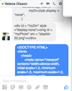
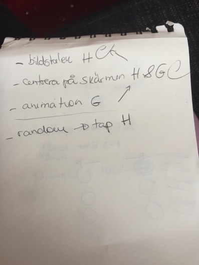
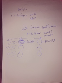
We tested how many steps it takes to access the lists – approximately four, which can be a little bit hard for those who are not tech savvy. We reduced it to swipe touch – If you want go forward/backward one list, you swipe up/down with one finger, and if you want to skip two, you use two fingers, and so on. Do you want a random playlist – we also think about creating this function. 

I suppose that in the beginning, it would take time for the user to learn all the combinations and use several fingers, since usually only one finger is used. But gradually, the user will gain experience, and with experience comes improved skills, until the user swipes through the lists without even looking at the screen.

As a starting point we wrote down the concept in a simplified way. The next step was to take a look at the Kattegat’s samples. We chose to focus on Pointer World and made modifications, to make it similar to swipe effect. It worked for one finger, in all four directions – up and down, left and right. However, if you wanted more fingers, you would have to make a lot of calculations in order to create coordinates for each finger. Imagine the trouble…So the plan is to keep working on it…

So, summarising, we spent this day simply sketching and exploring the possibilities and try to find a solution that can serve our design. To be honest, it felt so productive – we did not spend much time with divergence, because from the beginning we knew what design problem we wanted to solve, so we sorta went straight to the transformation/ideational process.

Tomorrow we cannot meet, since my partner helps students with programming, and I have doctor appointment. So we will be using Facebook chat instead of physically meeting tomorrow.

startingpoint

Starting point – Let’s change Pointer World!

startingpoint2

Creating functions…

Introducing the topic

Today was the kick off for the module 03, we were introduced to the theme nuance, pixels, and touch. We were asked to add depth, expressiveness to something that is seen as stepwise, and make it fluent – that is, we choose something that lacks depth, or nuance you can call it, and find interactions that involve repeated steps. Our goal is to collapse these repeated steps into a single, richer action.

This time we did not need to choose partners, they were assigned to us. I could not have asked for a better one – we are very similar, and think in the same wavelength. We came up with the same idea, namely simplify music application and how people interact with it, with focus on playlists. So the divergence phase in our design process was very short – we knew from the beginning what we wanted to work with and how to tackle it.

We were also asked to read a text written by Hurbert L. Dreyfus, “Intelligence without representation – Merleau-Ponty’s critique of mental representation”, whose take on skill development helps us to develop a concept that supports skill development as we perceive it.I read it, and found it somewhat abstract, the examples given were very outside our “hi-tech” reality. So let’s see how we can incorporate some of their ideas in our design.

Show ‘n’ tell plus reflections

Show ‘n’ tell – Our Concept

Today we presented our concept , which was based on personal space.

Negative scenario was someone creepy getting closer and closer to you, so your device starts playing alarm sound. The positive scenario was someone you are fond of approaches you, so your device plays a cute sweet tune.

The reception was positive – the teachers said that another group worked with similar concept, which can be considered good.

As Tony brought up, there is no “traditional” , skin-to-skin touch involved, but from a philosophical point of view, your personal space can be considered an extension of your body. Dimitros calls it “body aura”.

We were asked how we came up with this concept and we explained that Swedes value a lot personal space, so it is something central in the culture, and as a Brazilian everybody would expect me to be social, extroverted, which is not true in my case.

With other words we tackle the subjectivity of space, from a Kantian perspective.

This concept was not our initial one, though. As I have mentioned previously, a time reaction game was our first concept, however it wouldn’t lead to a deeper philosophical discussion, I suppose. Plus we were not allowed to use shock. Even though our concept was appreciated, I was not satisfied …I found our prototype too simple, unpolished, but I had to compromise, since it was a group work, not an individual one.

Show ‘n’ tell – Our presentation

Well, the presentation could have been better – I did not know when I should start saying something – my partner sounded insecure and nervous, so I took over, maybe I took too much space. I know I have this flaw – I get easily carried away, even when I am not satisfied with the result… and talk too much, leaving too little showtime for others.

Plus, the sensor has a life of its own, a personality – very sensitive and the prototype started beeping when it was not supposed to. But we were well aware of that before the presentation, so I was ready psychologically for this little issue.

Show ‘n’ tell – Other groups

While we did not really focus on skin-to-skin interactions, many of the other groups did – either handshakes, or touching. I found most of the prototypes very simplistic and unfinished as well, but one group stood out, with a very cool concept and execution was not bad either! I am talking about the guys with the hats – I don’t know their names, but their concept showed the difference of personality traits – one who is very easy-going, with a funny mushroom hat – all the time he gives a handshake he gets a gentle scalp massage (positive experience), and the other who is anti-social and doesn’t like handshakes, he is wearing too formal, stiff clothes, and top hat, and every time someone shakes his hand, he gets a mild shock (negative experience). With other words, they explore how people can experience /perceive same interaction in completely opposite ways – one perceives it as positive and the other as utterly negative.

Reflections

This module had an interesting premise – come up with a design that is wearable and enhances skin-to-skin interactions, leading to positive and negative experiences.

However, the literature left a lot to be desired and led to misunderstandings concerning the module project – For starters, one of the texts was about designing for provoking people, leading to negative emotions that could be transformed into something positive. According to the article, negative emotions such as disgust, fear and sadness can lead to an enriched and enjoyable product experience, and that is what is called “rich experience”.  Nevertheless, despite all the focus put onto rich experience,  that was not exactly what we were going to work with. So it left many people confused and led to misunderstanding.

Another text was about designing for wearability, which I found very androcentric – which body parts would be optimal to focus on when we develop wearables? Where does it feel more natural, comfortable? A wearable is a wearable if it is incorporated in someone’s life, like an extension of one’s body.  Chest was one of them in the text – under my breasts? No way! That is very uncomfortable, and my partner and other girls agreed with me – even Dimitrios!

The third text is not even worth mentioning, because it had very complicated diagrams, and we did not really discuss anything about it in our module, namely the text about tangibility, going beyond pixels – from GUI to TUI. Of course we know what is tangible and what is not, but this text overcomplicated things.

Not only the texts bothered me – the fact that we had to pick our partners, was an additional stress factor, since most of my classmates are new to me – I come from IDK 2014, and was on parental leave. So I came back to completely new people. I was okay with working on my own, because I love Arduino so it would have been cool to have “my own baby wearable” .

There was only one person left without partner, and there was no personal chemistry between us. She seemed so negative, and dismissed most of my ideas without even blinking. Besides she did not show much enthusiasm and interest either. But maybe she is also like me – more productive alone. I am also an introverted person and my brain loves solitude. However I also like to exchange ideas, and as Schön brings this up, designing is a social process in which communication plays a pivotal role, you are supposed to engage in an interaction with your partner, otherwise your design will suffer the consequences of malfunctioning communicative activity.

And finally, something else that frustrated me was the constraints – we are not allowed to use shock, some other sensors are expensive, and the cheaper ones too sensitive. And time is also an issue – we had a very short period of time and two people on never-ending divergence phase.

But one good thing I will bring with me to future assignments : That’s the way it is, so you gotta accept it…”Gilla läget!” Having a career implies interacting with people that otherwise we would never want to and still you gotta make it work, make the best of an uncomfortable situation.


Final adjustments

Today it was time to assemble the parts. and build the prototype. During the testing phase we noticed that the sensor is very sensitive, it does not take much to trigger it. The other issue we were aware of…that the sensor only reads one direction, namely when a person is approaching the sensor frontally.

And finally, the sound part…

I love Arduino, it was a shame that I had to keep it simple, due to time and resource constraints. Plus, I was the only one in the duo with Arduino experience, so I refrained from overcomplicating .

It was very fun to do the sound part with the piezo buzzer – I had to use some of my limited piano skills. But still I managed to code for the tune “Heart and Soul”. The reason I chose this tune for the positive experience is that I have very sweet and tender associations with it – me trying to keep up with my husband when playing this tune on the piano – very challenging but fun! Another association is with the movie “Big” with Tom Hanks at FAO Schwarz – I love the movie and the store, and that big piano on the floor is iconic!

I searched on Internet for inspiration and guidance on the best way to code it – I made my own version, it was not merely copy/paste.

The result was….well…okay…the piezo buzzer I have was a joke…very weak and it didn’t even work with resistor, so I had to remove the resistor from the circuit.

And the sound is not that smooth either…it reminds me of those ring tones from the 1990s. But still I was proud of being able to “translate” this tone into Arduino language.

Well, now it is too late for further polishing, and we did not have much time to tackle these issues – this module was very short and the divergence phase went on “forever”, it felt like that at least.

Here is a code snippet of the sweet tune used on the positive experience.

code-snippet-arduino

Coding in Arduino

And here is what the “final prototype” looks like

concept2

Our prototype


Working on the concept

Ok the beginning of this day was terrible – my partner did not want to work with the game anymore, and we were informed that we could not work with shock, because it is considered dangerous… Ok then! Back to scratch… and the divergence process continues – we try to come up with a new concept – we got valuable help from the teacher and he gives us some suggestions on how to make ideas come and flow. Awesome, we can go back on track then. She comes up with a concept called hug giver – with a heat pad in your shirt representing a hug. But what about the negative experience?

Then she just vanishes! Everybody working in pairs, and I was left on my own, without knowing what was going on… So I started talking to the teacher that I wished I was working on my own instead…but he said some wise words and tried to help me with the concept. Then she came back, and we discussed the concept further and I told her what the teacher suggested us to do.

So now, when we have a clearer idea on what we were going to work with, we were ready for some convergence to take place – what is the best way to execute our concept, what are our best possibilities? When I explained what we needed to make the concept work – money and time, in form of a modified Peltier device. Besides, the idea with hug for me sounded somewhat silly and pointless. So we have decided to make a similar and more fun version of it with sound as output, using a piezo buzzer: Creepy dude approaching you gets alarm sound, someone you like approaching you gets romantic, sweet tune.   And the input would be the distance measured by the ultrasonic range detector. So we decided to work with this concept, and started coding and hooking up our Arduino in the same day.  Was I happy with this choice? Not even close! I found it over-simplistic and “lazy”, two of the words I hate the most.

concept-3

Sketching the concept


Brief

Today’s lecture  focused on wearability and on its social aspect. Several examples on how to achieve a social interactive experience through wearables were presented in order to inspire us.

Today we were also presented to the assignment guidelines more in depth.

I thought I was going to work on my own, and I had already some clue on what I was going to do, until someone came to me and asked if she could work with me… but of course…Now we start from zero again. So the divergence process starts – we together try to define and delimit the problem, what we should focus on. We started brainstorming a little having two texts as starting point – one about rich experiences, i.e. how to turn a negative experience into positive; and the other about wearability – where on the body wearables should be worn. We discussed that from our own perspective – what kind of positive and negative experiences we feel most drawn to, and where on our body it would be comfortable to wear whatever we come up with. We both disagree with the text on wearability and think it has a very masculine perspective – it uses the manly body as reference for which body parts are optimal for wearables and which are not.

I came up with some ideas that were quickly dismissed by my partner. She was not even that interested in listening to me and my ideas , and she would take my jokes and sarcasm seriously…We have also sort of misunderstood a little bit the assignment – we thought that we were going to create something that leads to a rich experience, but instead it was to create something that leads to negative experience and to positive experience – it could be the same design but used in different contexts or it could be two distinct designs.

So some of our ideas turned out to be irrelevant or not really appropriate. So we had to start thinking again and brainstorming. She did not give me much…was she confused? I do not know, but it felt like I would have done it better on my own than with someone who does not really show interest.

In the end of this divergence session we were thinking about creating a reaction game that entails both reward and punishment. The idea was to make a 2-play reaction game – the slowest to press a button would get a shock or something similar, and the winner, some warmth in the hand. The prototype would be attached to an armband. It would be the upgrade of a project I have made earlier.

She was however hesitating, not really fond of the idea – but the thing is she did not have any other better idea either… so we decided to call it a day and we would have the whole weekend to think about the concept or to come up with something new.


Introducing the topic

The day started with a lecture, in which Dimitrios introduced himself to us and the module. We would be working this time with focus on experiences – positive and negative. When it comes to the material part, we were allowed to use basically anything that can be hooked up on Arduino.

In order to help our designing process he introduced to us some important concepts, namely divergence, transformation and convergence. In the beginning of a creative process you have divergence, which means that you will have to define the design problem – what needs to be done or improved? Anything we can develop further? Once you know what the problem is, the transformation process takes place, which is also called ideation – process of generating, developing, and communicating new ideas – it can be in form of brainstorming, bodystorming, Thinking hats etc. And finally we have convergence, which takes place when we evaluate, refine and choose the best possibilities we have come up with.

Besides the lecture, we had text seminar around three texts: one dealing with designing for wearability, another about rich interactive experiences and finally a third that tackled tangibility. With that in mind we would have a good starting point to work on module 02 – skin-to-skin interaction and wearables.

The seminar and the day’s lecture were fruitful and helped me to come up with some ideas of my own. Now I was left with an almost impossible mission – find a partner – this time the teachers opted for self-assigned pairs, and I knew that most of my classmates had already chosen someone. But I was quite okay with the idea of working on my own – I had plenty of ideas, and quite nice set of skills.

Show ‘n’ tell

Okay…I made some changes as I said I would during the weekend…the problem is that I forgot to show the changes to my partner, but I thought it would be ok, since what I have changed is not really central in our concept, namely the background. If there are more than 20 devices, there are plenty of unicorns running (it reflects the crowdedness aspect), and if there are fewer than 20 devices, there is the image of one crying unicorn. It is me who drew the unicorn, so I thought it would be cool to showcase my skills!

My partner informed me that he was sick and could not come to the presentation…PANIC! I wanted to show my version to him…and if he did not like we could use his version…but as he was sick, I did not want to bother him with something so insignificant, at least for me.

The presentation was okay, even though we got much criticism, but at least of the constructive kind, and I actually agree with them. One of the criticisms is that our concept was giving a “black-or-white” idea – it is either too many devices, or too few devices, we do not explore anything in the middle.

Another criticism is that our concept is sort of normative – we tell the user how she/he is supposed to feel if there are many/few people around – we did not leave much space for the user to experience one’s own feelings. It is as if we are imposing feelings related to crowdedness and emptiness. As Kant puts it, space is a subjective notion, so we all experience it differently. And finally, when it comes to the website, we should have removed the instruction part, really unnecessary. Additionally the unicorn animation when there are too many people was somewhat too “frenetic”and could make people more nervous instead of calmer. But according to my classmates we succeeded in causing impact on their mood.

My own reflections about the module was that we took for granted people’s attitude toward emptiness/crowdedness, we made assumptions that are not necessarily true.  We should have left more space for interpretation, user’s own experience instead. It felt like we were designing for ourselves, instead of adopting a user-centred design.

Another problem is communication and working in pair – my partner tended to work on his own, or alone get help from his buddies and would leave me “in the dark”. I had to ask him constantly how things were going, and what I was supposed to focus on, and I even had to say “it is actually an assignment in pairs, so we should do it accordingly.

But I also should have asked him about the animation before presenting, we both have flaws and we learn from our mistakes.

Anyway, that’s how our page looks like now

Finally!

Today we finished our work with the website, and we coded in a way that approximates the amount of Bluetooth devices close to a MAC address you enter in a text box – something added today after some struggle.

Furthermore we added new sounds that play according to the amount of BT devices in the vicinity. If there are more than 20 devices a calming tune will be played – the choice was Eric Satie’s Gymnopedie No.1, if there are fewer than 20 devices , a jolly song with children playing and birds chirping will be played in order to cheer up the user.

We also added a new background for the page, which we found on codepen.io. This is what our webpage looks like right now.

explore


Honestly, I was not 100% satisfied with the choice because it feels so unrelated to our concept and static. So I said that I would look for other alternatives during the weekend and try to “pimp” it a little bit.


Hell yeah

Ok today I was on fire! If on Monday I felt like an technologically impaired duck, today I felt like that nerdy kid dancing.

nerdy

As mentioned before, we were having some issues with play and stop buttons…well the stop button was created but no listening event. So we started coding and looking for solution. When my partner went for lunch I kept trying different ways to make the sound stop and then I faced another problem – once you stop you could not resume the playing. After reading on several fora, such as Stackoverflow, I found the solution to resume. And we were also having some issue with the start button  -In order to make the songs change on their own, we had to set an interval so it would refresh every 2 seconds. But still on iOs devices you would have to press play in order to refresh.  So I showed my stop-button solution to my partner, and together we incorporated it to “Play” button but with reverse logic. It worked like a charm! Now we could play and stop without any problem on mobile devices, and on the web version it worked really well.


code-snippet

Tinker tinker

So I came to terms with using approximate number of bluetooth devices in vicinity rather than the accurate number. We managed to count the approximate number of devices, but as my partner pointed out before, it is not that important to have the exact number, since all we need to know is if there are many or few bluetooth devices around us.

As the sound would not play in some mobile devices, we had to add a “start” button, making it possible to play audio on every mobile device – Android and iOs based ones. A problem is the ever-looping sound…the music would keep playing, and you would have to close the browser window to make it stop. So the solution was to create a stop button.

Today we also discussed whether we should add some animation to the website or not – the website design is not the central element in our concept – the idea is to keep your mobile phone in your pocket, with your earphones plugged. The output in this case is the sound, so you would not really be looking at the screen.

Nevertheless, our website looks really simple, it feels so incomplete and empty. So we decided to work on the design, since the coding part was almost done, except from the start/stop minor issues.

That’s what we have so far:

unpolished

Not very pretty, ay?


Technologically impaired duck

Today I felt like the meme “Technologically impaired duck” – completely incompetent in coding, having hard time in making it work. I even forgot to connect my phone to Internet in order to check if it was working or not. After so much struggling and help from classmates, we found a way to count approximately how many Bluetooth devices there are in the vicinity, but really roughly. I wanted an exact number, and I was very frustrated about not being able to do it.

duck

But my partner made a very valid point – the exact number of devices is not very relevant, the important here is to show how our concept works, so it is ok to work with inaccurate data. I had hard time to accept it in the beginning because I hate inaccuracy, but I realised I was being silly.